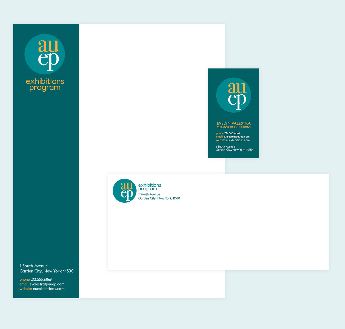
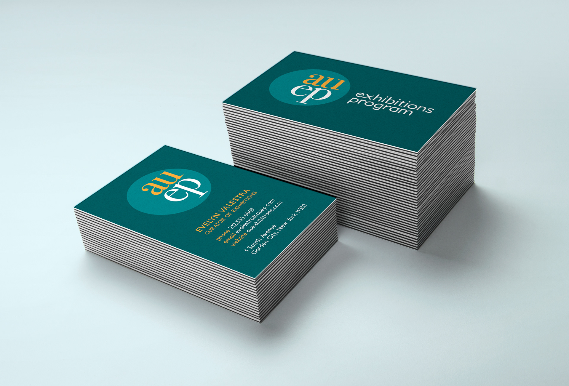
The Adelphi University Exhibitions Program wanted a fresh look and a new identity. This logo was created as part of a class competition to win the bid to re-brand the Exhibitions Department.
My logo was selected and was used in the five University Gallery spaces. It was placed on gallery cards, post cards and on social media graphics.
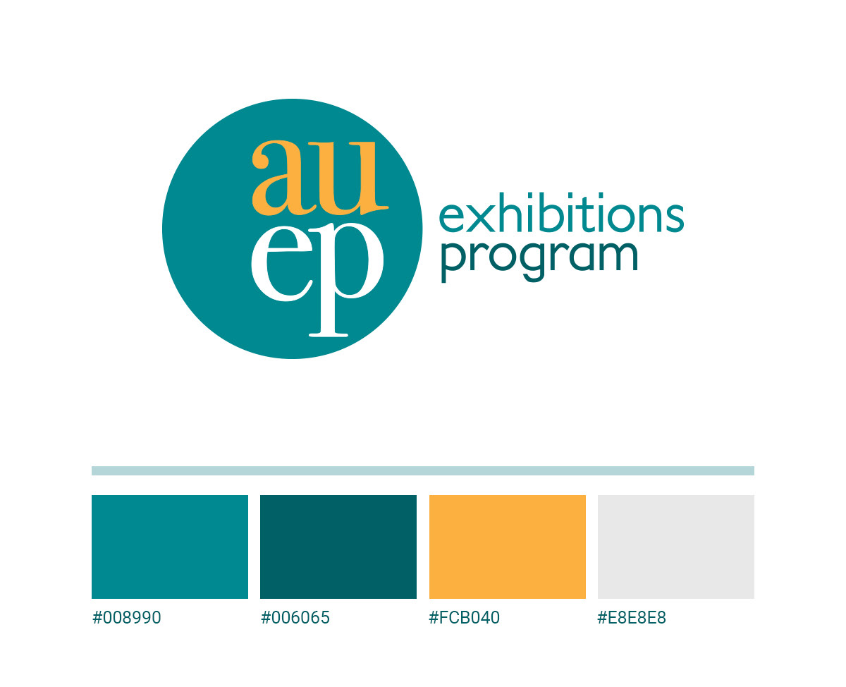
I chose to combine a clean, fresh sans-serif with a modern serif font. The goal was to promote the galleries as being modern and cutting-edge. Teal hues were used to add uniformity with a shock of one orange hue to make the logo dynamic and eye-catching.
I used all lowercase letters specifically because of the beautiful curvatures and rounded edges it created. To reinforce the lovely curves of the letters, I encased it in a circle. I completed the dynamic look by making the letter forms right aligned in the circle; this helped to balance the strong descender in the “p” while also placing the logo mark little closer to the logotype when the logo is displayed horizontally.